


The New Goldman Sachs Logo Did Not Need 180 Pages.
The New Goldman Sachs Logo Did Not Need 180 Pages.
I have a few issues with this corporate rebrand.

Recently, I came across a post1 that talked about the 2020 rebrand of Goldman Sachs from this to this:

Now if you know me, you know I’m a sucker for a good rebrand, even if it’s subtle. But my lord. How they massacred my boy.
Now, due to some justified backlash, they’ve brought back the classic ligatures. What did they add? A shiny new logomark. Ladies and gentlebrands, I present to you… GOLDMAN SACHS!

Woof. Now, it isn’t all that bad, I’m just being dramatic. However there are a few critiques I have of this.
The rebrand document (180 pages btw) references the classic expensive-rebrand cliches like “heritage, prestige, and precisions”2 but it doesn’t feel that way. When I first started designing I would make logos that look EXACTLY like that.
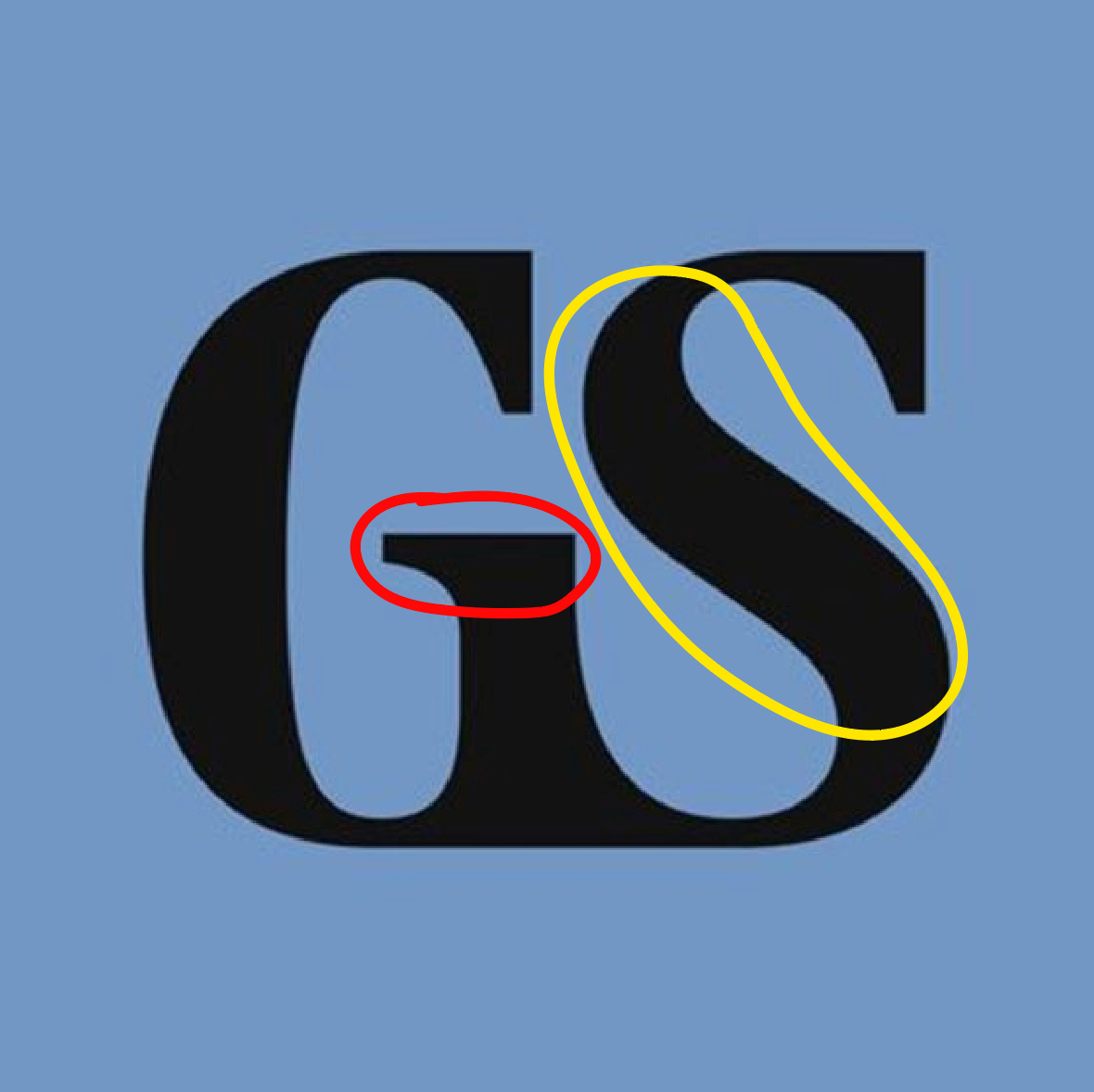
There is no center-point. Take a look at this graphic I’ve made. In the red, there is a serif that goes against the grain. It’s a salmon-serif, going upstream and going against the flow of the other two serifs. The steam of the S, highlighted in yellow, is also going against the flow of the first two thick stems. The back of the G and the merge between the G and the S stick straight up, but the S goes down and to the right.
I understand that Jones Knowles Richie, the agency that did the rebrand, wanted to keep the ligature found in the original logo (see: pre-2020 logo on the left up top) but it looks like the kerning was turned all the way down and shape builder was used to fill in the space in between. Why wouldn’t they just use the vertical ligature found in their word mark? They already use it on portions of their website:
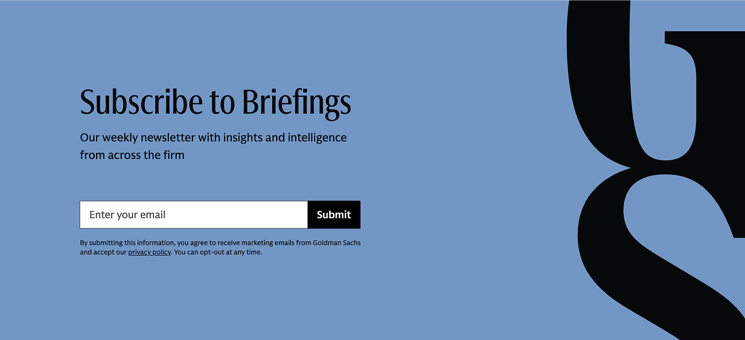
Goldman Sachs newsletter website section.


With all this being said, I don’t know what I would do instead. Let it be known that me giving this critique is not me saying I would do much better than a team paid millions of dollars to do so. What I am saying is it should not have cost a million dollars to make this. It’s the same thing with the Pepsi rebranding. 180 pages of brand identity does not help the fact that it looks like someone just lazily put the two letters together.
My question is how did this happen? How did Goldman Sachs, a powerhouse in banking, spend millions of dollars on something as simple as a return to the old word mark and a lettermark that just feels lazy?
I have an idea, and it is time. Rebranding takes time and money, sure, but it also takes a ton of back and forth between the agency and the client. In this case, the agency is f*cking huge and the client is f*cking huge, which I am sure resulted in a major communications bottleneck. I’m just know that some designer at JKR is reading the public feedback thinking to themselves “they should’ve gone with my revision”.
Look, it’s hard on it’s own figuring out what the client wants. Adding in the fact that the company had JUST went through a heavily critiqued rebrand is a whole other ball park.
My point is: The fact that this rebrand is 180 pages and cost millions of dollars just to result in a new lettermark and a return to the old logo just goes to show how important clear and concise communication is. There is no blame to give. This is just a lesson that all brand designers must learn from.
I don’t know how else to end this. Bye bye!
https://www.creativebloq.com/design/logos-icons/the-new-goldman-sachs-logo-is-giving-me-serious-deja-vu
https://www.businessinsider.com/goldman-sachs-new-logo-and-website-before-and-after-2024-7